PhD Research · Keele University & UHNM NHS Trust

Bedside Clinical
Guidelines

A mobile iOS application delivering evidence-based clinical guidelines at the point of care, co-designed with NHS clinicians.

5 peer-reviewed papers  ·  15 usability recommendations  ·  Deployed within NHS Trust

The Problem

Clinical guidelines designed for print, not for the point of care.

150 NHS clinical guidelines exist as dense Word documents and PDFs, pages of tightly formatted text, complex decision flowcharts, manual drug-dosing equations, and tables that require scrolling across on a phone screen. Clinicians need answers in seconds. The original formats were not designed for that reality.

Original guideline
Original Atrial Fibrillation guideline, dense text

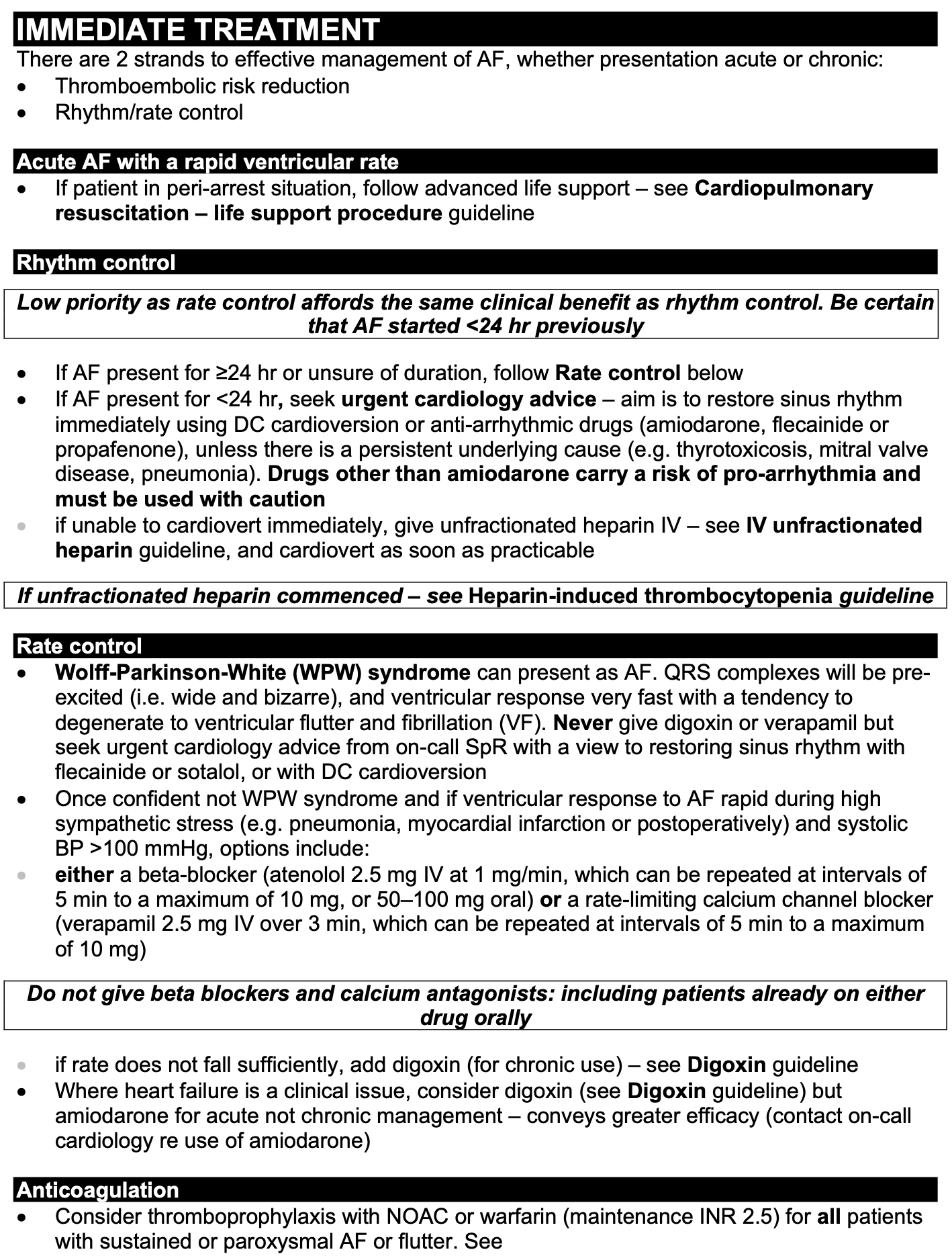
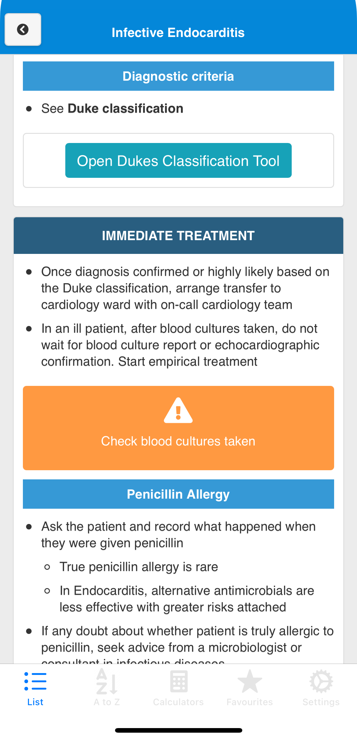
Atrial Fibrillation, wall of dense clinical text, complex bold/italic formatting, and multi-level bullets that require careful reading, not scanning.

Original guideline
Original PE diagnostic flowchart

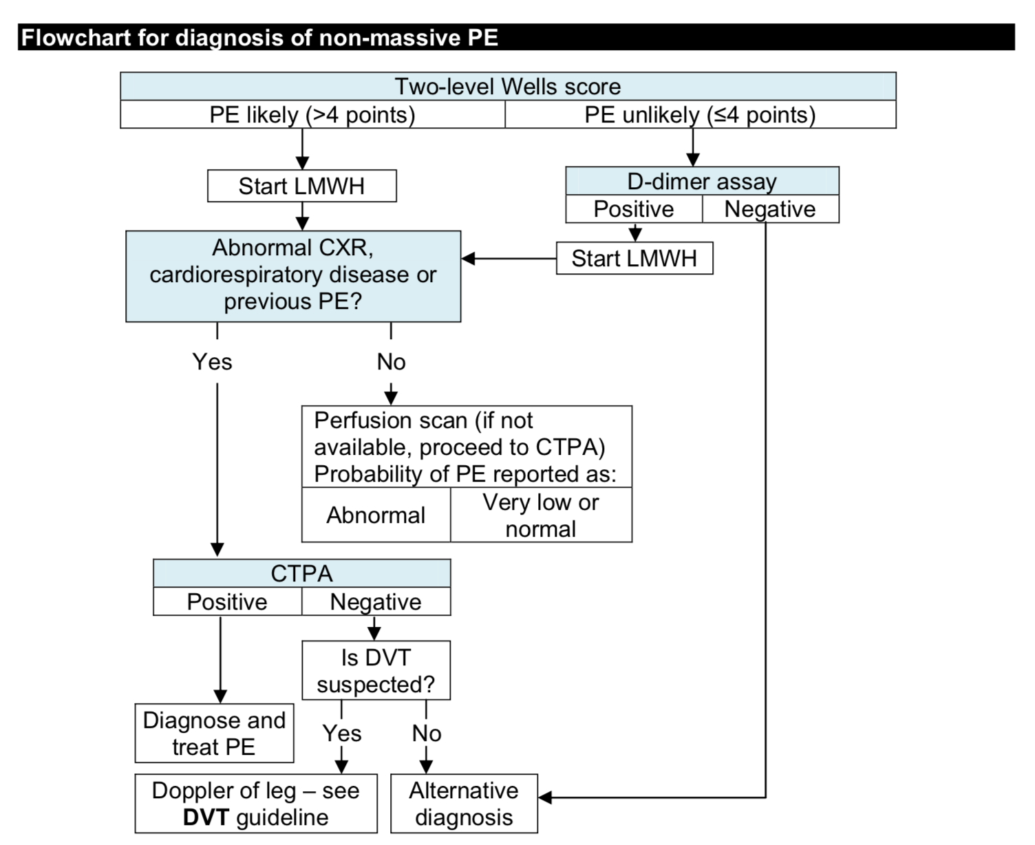
Pulmonary Embolism diagnosis, a complex branching flowchart impossible to follow on a mobile screen under ward conditions.

Original guideline
Original Gentamicin nomogram, manual calculation required

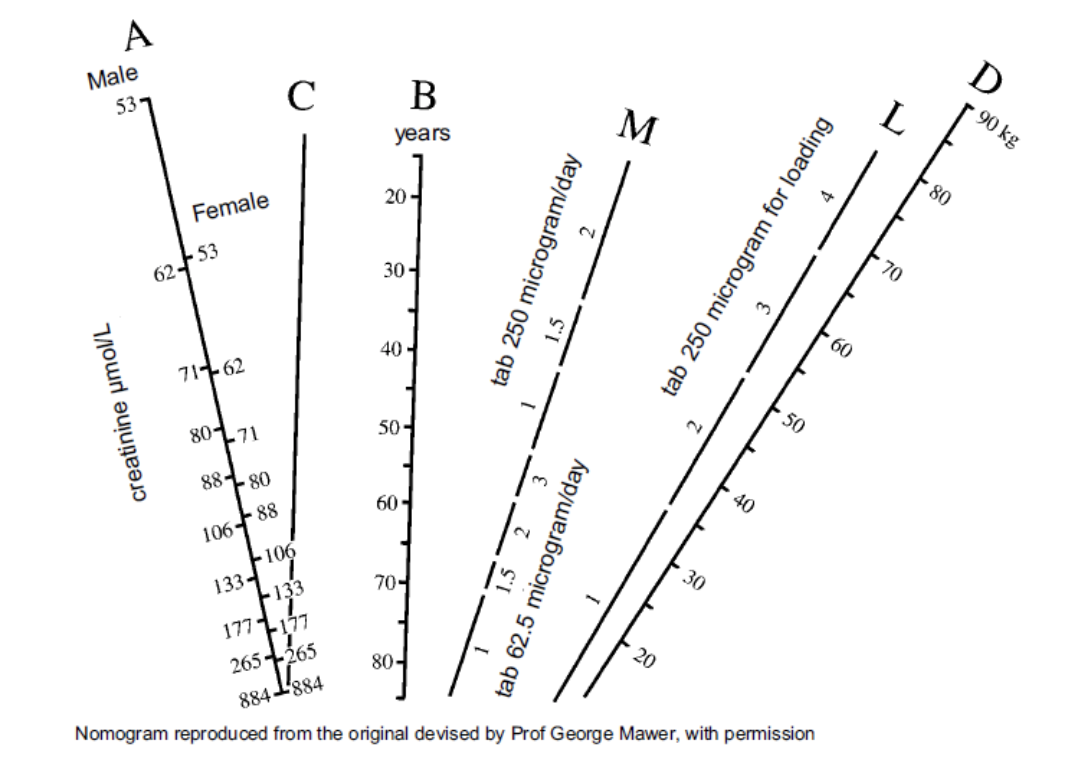
Gentamicin dosing, a nomogram requiring manual calculation using ruler and pencil interpolation, performed under time pressure at the bedside.

The Solution

Not a digital PDF. A rethink from the ward outwards.

This project began as Dr. Mitchell's PhD at Keele University, in close collaboration with University Hospital North Midlands NHS Trust. Working alongside respiratory physicians, nurses, and junior doctors through contextual inquiry and iterative usability evaluation, every design decision was shaped by observed clinical behaviour, not assumed needs.

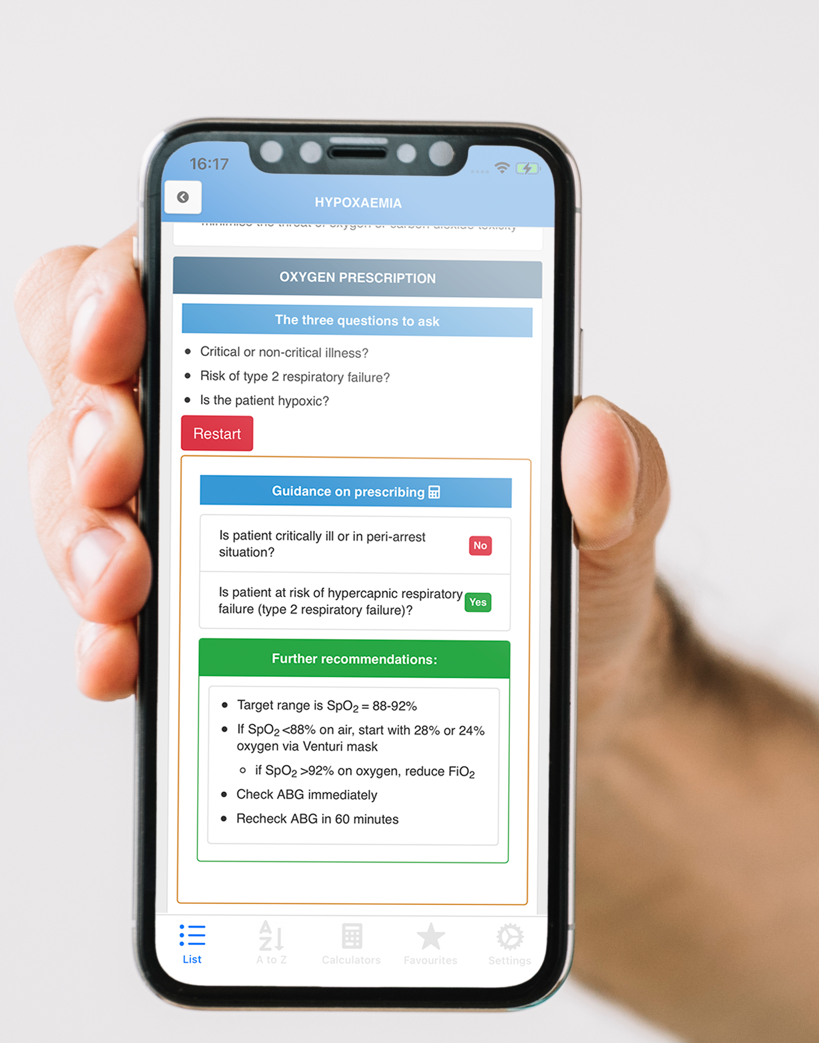
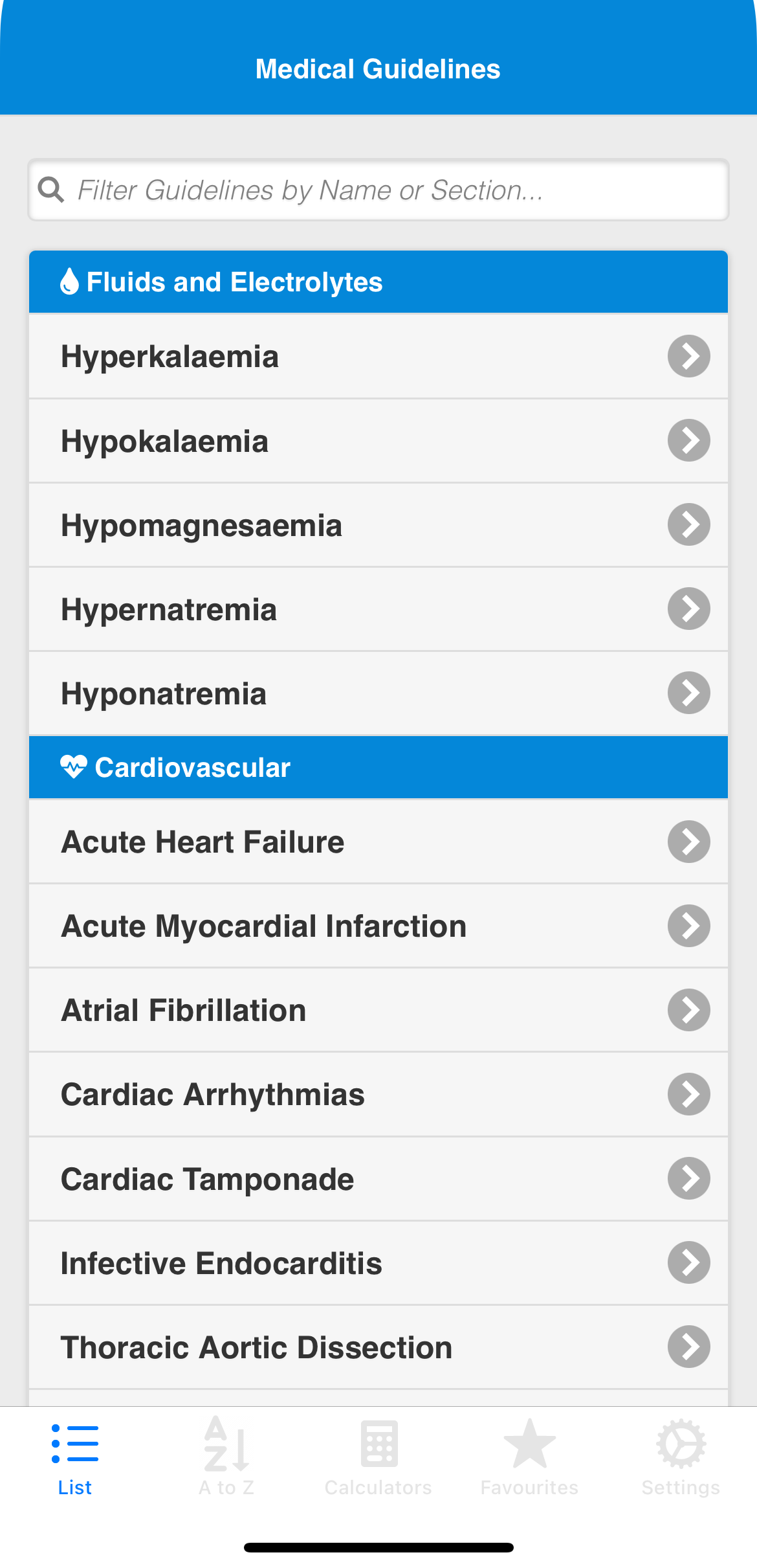
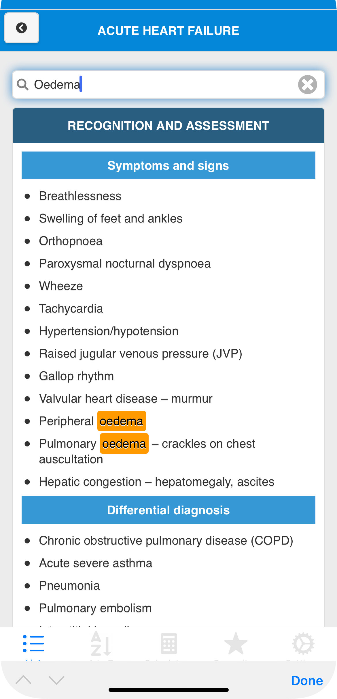
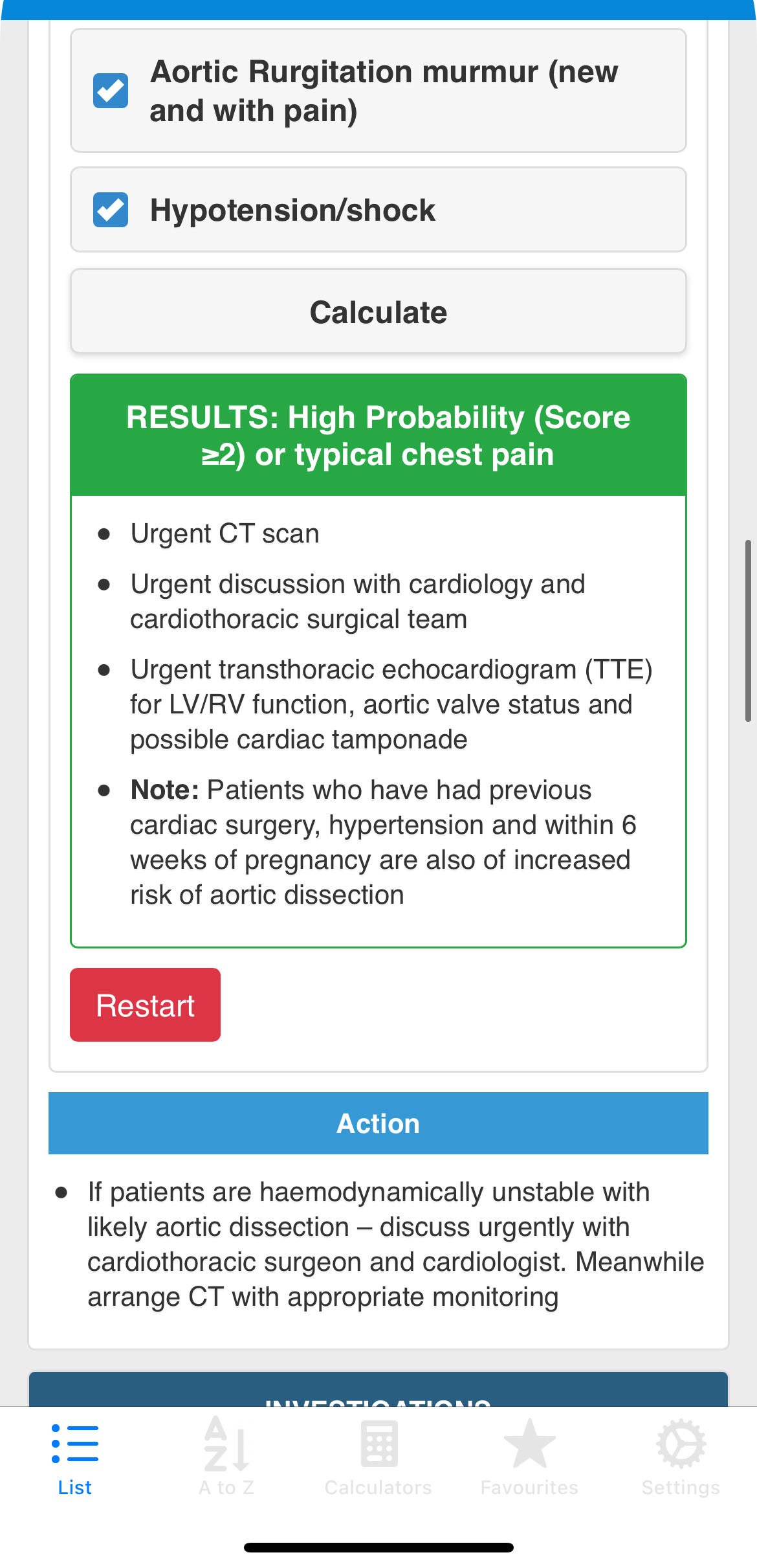
The result was the Bedside Clinical Guidelines (BCG) iOS app, 150 guidelines restructured into a two-tier visual hierarchy, with inline calculators, embedded decision tools, and a co-designed warning system. Deployed within UHNM NHS Trust, evaluated across five published studies, and producing 15 peer-reviewed design recommendations.

150

Guidelines

5

Papers

NHS

Deployed

Clinician holding phone showing BCG app

Methodology

The User-Centred Design Process

A five-study product research programme moved from field observation to a deployed iOS clinical tool. The work combined contextual inquiry, information architecture, prototyping, usability science, and implementation.

A five-study UCD programme, from ward observation to deployed iOS app.

The programme began with contextual inquiry, shadowing NHS clinicians at the bedside to understand how guidelines were actually used under time pressure. That fieldwork drove an information architecture study, iterative prototyping, two published usability evaluations, and ultimately a governed clinical app deployed within an NHS Trust.

01 Observe

Contextual inquiry

Shadowing, interviews, and task analysis identified ward constraints: unreliable Wi-Fi, seconds-long decisions, mobile reading, and gloved interaction.

Electrolytes
Cardiology
Respiratory
Emergency

02 Structure

Information architecture

Open and closed card sorting translated clinical mental models into a two-level navigation taxonomy and search-first information structure.

03 Prototype

Iterative design

Low-fidelity sketches, digital mockups, and working iOS prototypes refined typography, tap targets, content hierarchy, and decision tools.

SUS + QoE

04 Evaluate

Usability science

Clinicians completed representative tasks using SUS, think-aloud protocols, timing/error measures, and physiological signal capture.

Live pathway

05 Deploy

Clinical implementation

The offline-first app was deployed within UHNM, validating the route from field insight to governed content and real clinical use.

The App

Clinical guidelines, rebuilt for the ward.

The interface prioritised fast navigation, readable guideline sections, inline clinical decision tools, and safety warnings that stood out without disrupting bedside use.

Fast guideline navigation

Search and category browsing help clinicians reach the right guideline quickly under ward conditions.

Design rationale

Two-level hierarchy reduces cognitive overhead under time pressure, determined by card-sorting data from NHS clinicians, not administrative filing structure.

Research basis

Contextual inquiry identified that clinicians needed to reach any guideline within 2–3 taps. Card sorting with NHS clinical staff directly determined the two-level navigation taxonomy.

Guideline navigation screen
Clinical content screen
Decision tool screen
Safety warning screen

Navigation

Every guideline in 2–3 taps.

Card sorting with NHS clinicians shaped a two-level navigation taxonomy that mirrors clinical mental models rather than administrative filing structure. Categories reflect how clinicians think: Fluids, Cardiovascular, Respiratory, Neurology.

A persistent tab bar provides instant access to the category list, A–Z view, calculators, and favourites at any depth in the navigation hierarchy. Full-text search filters across all guideline titles and section headings simultaneously.

Category browsing A–Z view Full-text search Persistent tab bar
Medical Guidelines
Filter guidelines by name or section...
Fluids and Electrolytes
Hyperkalaemia
Hypokalaemia
Hypomagnesaemia
Hypernatraemia
Cardiovascular
Acute Heart Failure
Acute Myocardial Infarction
Atrial Fibrillation
List
A to Z
Calc
Favs
Settings
HYPERCALCAEMIA
Search to filter sections
Recognition and Assessment
Symptoms and signs
Unusual unless calcium >3.0 mmol/L
GI: nausea, vomiting, constipation
Renal: polyuria, polydipsia
CVS: hypertension, altered QT interval
Initial Management
IV fluids
0.9% sodium chloride 1L over 4–6 hours, repeat until euvolaemic

Content Design

Complex information, designed for scanning.

NHS clinical guidelines are written for print. The BCG app restructures each guideline into a two-tier visual hierarchy, dark section headers for major clinical phases, blue subsection banners for clinical tasks, so clinicians can locate the exact piece of information they need in seconds.

Typography, tap target sizes, and contrast ratios were all specified to work under ward conditions: bright overhead lighting, gloved hands, and sub-five-second decision windows. One hundred and fifty guidelines were reformatted, verified, and validated with respiratory physicians and nurses.

Two-tier hierarchy Section-level search 150 guidelines Clinician verified

Decision Support

Decision algorithms and calculations, automated and inline.

In the original guidelines, decision algorithms were static flowcharts requiring manual navigation, and drug dosing calculations, such as the Gentamicin nomogram and Cockcroft-Gault creatinine clearance equation, had to be worked through by hand at the bedside, on paper, under time pressure.

The BCG app makes both fully automated and inline. Decision algorithms run as interactive, step-by-step tools, the clinician answers branching questions and the correct path is computed for them. Dosing calculators take patient parameters as inputs and return the correct dose and infusion volume directly, with no manual arithmetic. Both appear within the guideline they belong to, requiring no activation and no app switching.

Automated dosing Interactive algorithms Inline results No context loss
Vancomycin Calculator

Patient Height (cm):

186

Patient Weight (kg):

96

Select Sex:

Male

Serum Creatinine (micromol/l):

220
Calculate
Results
Creatinine Clearance (ml/min) 47.21 ml/min
Loading Dose 2 g

Critical, immediate action

If aortic dissection suspected, refer for urgent investigation. Do not delay, mortality is 1% per hour and can be reduced by prompt treatment.

Hypotonic or potassium-rich maintenance fluid is inappropriate when given in large volumes required for resuscitation.

To check you are using the correct guideline, see the Adult Fluid Management guideline.

Safety Warnings

Warnings you can’t miss: and won’t ignore.

Alert fatigue is a documented failure mode in clinical decision support. The BCG warning system classifies each alert into one of nine severity categories, using Font Awesome's warning triangle (red and orange) and stop-hand (blue) icons, each co-designed and validated with respiratory physicians and emergency nurses.

The design went through extensive saliency experimentation. Dozens of colour, size, weight, border, and layout variations were explored before converging on the final system. At one stage, a scroll-triggered vibration was prototyped, when a critical alert entered the viewport it would physically shake to arrest attention. The red warning demonstrates this on scroll.

9-category system Colour-coded severity Saliency-tested Vibration explored

Design iterations

Saliency experiments & alternate treatments

Before converging on colour-filled blocks, multiple visual treatments were tested for saliency. Below are a selection of the approaches explored, including animated and dynamic variants.

Outlined, early iteration

Dopamine must only be used in critical care and administered preferably via a central line.

Dark background, high contrast

Dopamine must only be used in critical care and administered preferably via a central line.

Pulsing ring, attention signal

If aortic dissection suspected, refer for urgent investigation. Do not delay.

Amber, referral category

If arrhythmia causing hypotension or requiring pacing, seek urgent advice from cardiology team.

Compact inline, minimal variant

Dopamine: critical care and central line only.

Check you are using the correct guideline.

Animated popup, scroll trigger

If aortic dissection suspected, refer for urgent investigation. Do not delay.

Research Output

15 Design Recommendations

Derived from iterative co-design and usability evaluation with NHS clinicians, these recommendations address four dimensions of mobile clinical guideline delivery.

Navigation & Structure

01

Provide multiple methods of accessing content in list views, both category browsing and A to Z.

02

Minimise unnecessary wording in titles, e.g., 'Acute heart failure' should appear as 'Heart failure'.

03

Provide a menu that can be easily accessed at all times, preferably using a persistent tabbed menu design.

04

Utilise icons and images alongside text headers to aid rapid visual scanning under time pressure.

05

Provide a basic filter function for content in both menu and information sections, clinicians navigate by condition name more often than category.

Content Presentation

06

Reduce the use of long sentences and provide information as succinctly as possible, ward conditions demand rapid scanning, not reading.

07

Utilise acronyms to reduce visual density, but provide a method of expanding or explaining them where context is needed.

08

Be cross-platform where possible, clinicians use a mix of personal and trust-issued devices at the bedside.

Tools & Decision Support

09

Minimise manual tasks, drug dose calculations and risk scoring should be automated, not left to the clinician to perform independently.

10

Provide as many tools and resources as possible within the app to minimise the need to switch to other systems during an assessment.

11

Provide clear decision algorithms and calculation tools in line with guideline content, immediately accessible, not requiring separate activation.

12

Provide original content for any tools or decision algorithms, validated, locally-adapted, and traceable to source guidelines.

Warnings & Alerts

13

Minimise the total number of warnings and alerts to avoid alert fatigue, only safety-critical information should trigger a high-visibility alert.

14

Display warnings in line with relevant content, salient in visual design, succinct in wording, and explicit about the action or risk involved.

15

Repeat warning content within the surrounding main information text, clinicians who miss the alert box should still encounter the safety information.

Key Findings

What clinicians actually need.

Three findings from across the UCD process recurred consistently and shaped the final design recommendations.

01

Minimal-tap navigation

Clinicians need to reach the correct guideline in 2–3 taps. Deep hierarchies and nested menus fail in busy clinical contexts. The card sorting data directly determined the two-level navigation model adopted in the final app.

02

Offline-first architecture

Wi-Fi is unreliable on wards. Network dependency is a critical usability failure in clinical settings, identified directly through contextual inquiry. All content was bundled locally, eliminating any dependency on hospital network connectivity.

03

Typography & visual density

Information density, font size, and contrast matter when reading on a phone under bright ward lighting or while wearing gloves. Small screens in clinical environments demand deliberate visual design decisions absent from general mobile UI guidance.

Publications

5 papers. 15 recommendations.

Each paper maps to a stage of the UCD process, building from contextual requirements through design to physiological evaluation.

The Development of a Point of Care Clinical Guidelines Mobile Application Following a User-Centred Design Approach

Mitchell et al. (2020) · BCS HCI Conference

DOI →

15 Usability Recommendations for Delivering Clinical Guidelines on Mobile Devices

Mitchell et al. (2021) · 34th British HCI Conference

DOI →

Design Recommendations for Presenting Clinical Guidelines on Mobile Devices

Mitchell et al. (2022) · Studies in Health Technology and Informatics

DOI →

Applying Recommendations and Working with Clinical Experts to Understand, Adapt, Verify, and Validate Clinical Information for Mobile Delivery

Mitchell et al. (2022) · 35th BCS HCI Conference

DOI →

Using Physiological Signals to Measure the Quality-of-Experience of Health Care Professionals when Interacting with a Clinical Guideline Mobile App

Mitchell & Kanwal (2022) · 35th BCS HCI Conference

DOI →
Keele University

Keele University

School of Medicine · Staffordshire, UK

UHNM NHS Trust

UHNM NHS Trust

University Hospital North Midlands · Stoke-on-Trent

PhD

Research

NHS

Trust

15

Recommendations

5

Papers

Related Project

CLARK: the authoring tool behind BCG.

CLARK (Clinical Guidelines Admin Resource Kit) is a live authoring environment built to support the BCG app. It gives content teams a single workspace to edit guideline text, decision pathways, safety alerts, and embedded calculators, with the mobile experience updating in real time as changes are made. It was developed as a proof of concept for treating clinical guideline publishing as an interactive design problem rather than document maintenance.

Learn more about CLARK

What CLARK enables

Live guideline content editing
Decision pathway authoring
Safety alert configuration
Real-time mobile preview